ShopDreamUp AI ArtDreamUp

Deviation Actions


Description
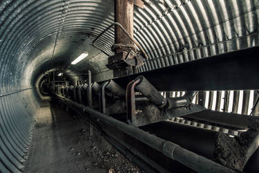
stalowe wrota do wnętrza przemysłu
.....................................
'gates'
steel gates to industrial innards
.....................................
'gates'
steel gates to industrial innards
Image size
666x666px 379.85 KB
Make
Canon
Model
Canon EOS 30D
Shutter Speed
1/20 second
Aperture
F/2.8
Focal Length
17 mm
ISO Speed
100
Date Taken
Aug 28, 2010, 11:37:44 AM
Sensor Size
4mm
© 2010 - 2024 BreathOfIndustry
Comments36
Join the community to add your comment. Already a deviant? Log In
The piece in its entirety is its cynosure: it does not guide the eye, but allows it to guide itself....
A very chilling atmosphere, like the setting of the film Aliens or any other well done Science Fiction thriller. The lighting is just fantastic; bright in places so as to cast eerie shadows, but it is also dark in others, allowing the mind to wander, the imagination to wonder and the eyes to play tricks... what goes bump in here, in this dark place? It gives that feeling that something untoward or gruesome, misshapen and terrifying may come quickly (i didn't want to say "jump" or "pop") from around the corner of one of the machines. Or it may instead reach down some horrible, mutated hand or inhuman claw from one of the exposed air vents. I love pieces like this; ones that allow the mind to fill in the blanks, that sends shivers up and down the spine, that plays tricks on the mind.
It is the most excellent execution of technique that allowed for this. The exposure is, to me, perfect. It allows for just the right amount of light, just the right amount of visibility to still allow for unseen movements. The focus seems, again to me, perfect. There is no forced perspective, no one focal point; for an f-stop of 2.8, all things are amazingly clear and crisp. Everything is in focus, there is no one area that screams, "Here! Here I am, look here. I am the centre, the core, the nucleus of it all." The viewer's eyes are thus allowed to wander across the piece, to search out and try to peer into (and around) corners. Yes, the piece naturally draws you down the centre line of uneven concrete slabs toward the terminus (a brilliant touch) but there is so much to absorb along the way, that it takes time.
I for one really enjoy the colour here, nothing is too brightly coloured or over-saturated; the piece has a subdued and even colouring, a subdued and even quality. I absolutely respect (and envy) the restraint displayed in the editing as a whole; though most especially in not over-colouring or over-saturating certain areas (a definite failing of mine <img src="e.deviantart.net/emoticons/w/w…" width="15" height="15" alt="
"There is no need to worry, nothing to fear, the lights are on... but what happens when the lights go out?"